Mini-Review: X-Rite M50103 ColorChecker (Grayscale)
Mini-Review: X-Rite M50103 ColorChecker (Grayscale)
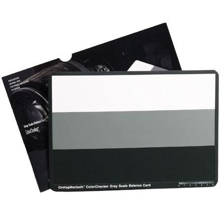
Today I received the X-Rite M50103 ColorChecker (Grayscale). Even though I've had it for just one day, I wanted to mention how much of a top-notch product this is.
Here is a sample of the card against one of our backdrops. This has been lit with our two AlienBees strobes, 45° angle from camera-center on both the left and right-hand sides. Click on the image for a larger view:

From left-to-right are the following:
- In Camera: The straight-out-of-camera white balance. This is from my Canon 7D with the white balance mode set to Flash. Not bad, but it's pretty warm.
- Lightroom Preset: From Lightroom 5, setting the white balance to the built in Flash preset. Not bad, but still on the warm side.
- Lightroom Eyedropper Pick: Using Lightroom's white balance eyedropper tool, the balance has been set to the 18% gray stripe. This is my personal favorite from the set; the color is very natural.
- Photoshop Gray-point Curve Set: Using the Photoshop Curves dialog and the gray-point eyedropper, the 18% gray stripe was selected from the card. This is very similar to the previous photo, but to me it still feels a bit warm.
And here's an example being applied to a subject:

This card works very well in my Lightroom workflow. I really like that it's a larger size than my old pocket-sized cards, making it easy to get a feel of the light being thrown in its direction. It's also large enough that it's easy for people to hold in the photo, but not too large to where it would be awkward.
I'd recommend this to anyone that wants to improve the color quality of their photos. Purchase yours on Amazon.com.